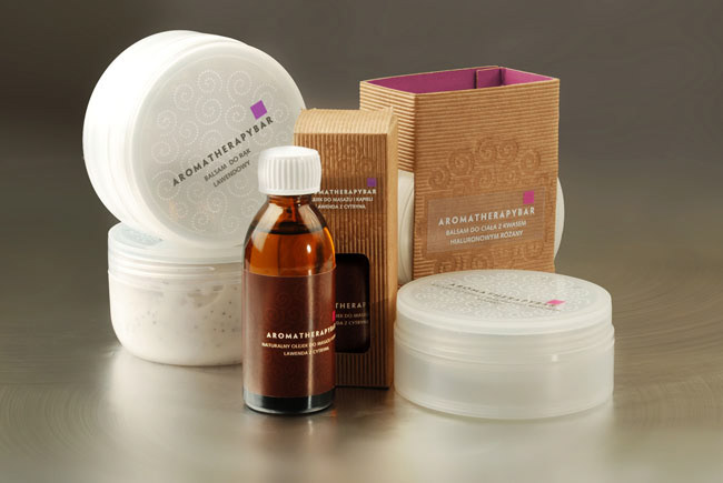
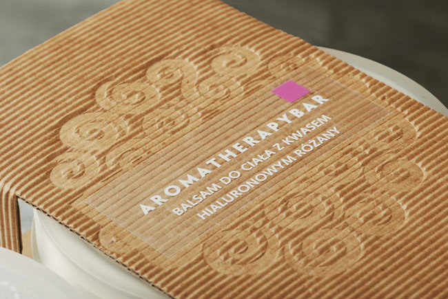
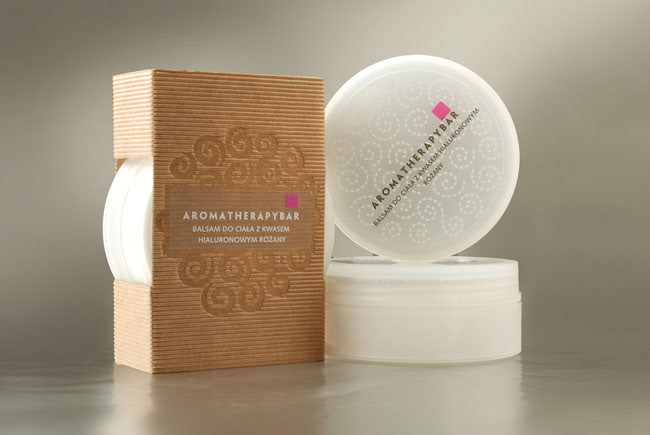
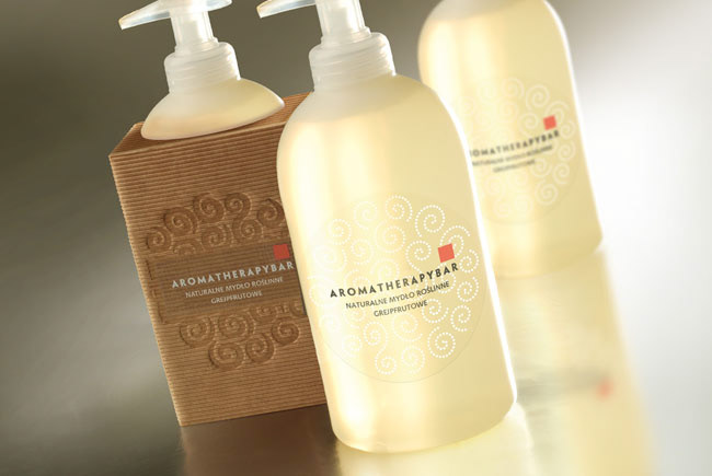
Aromatherapybar
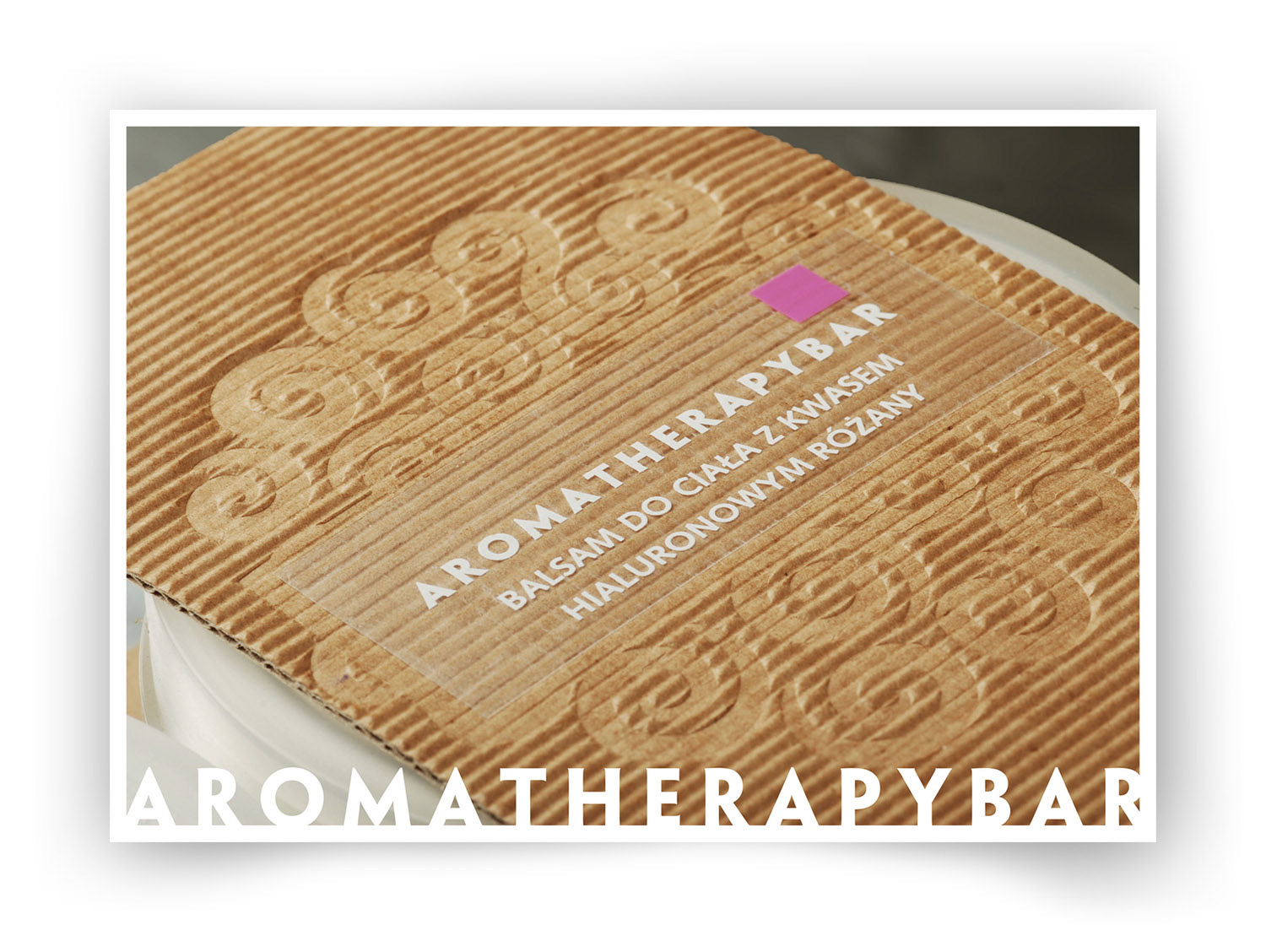
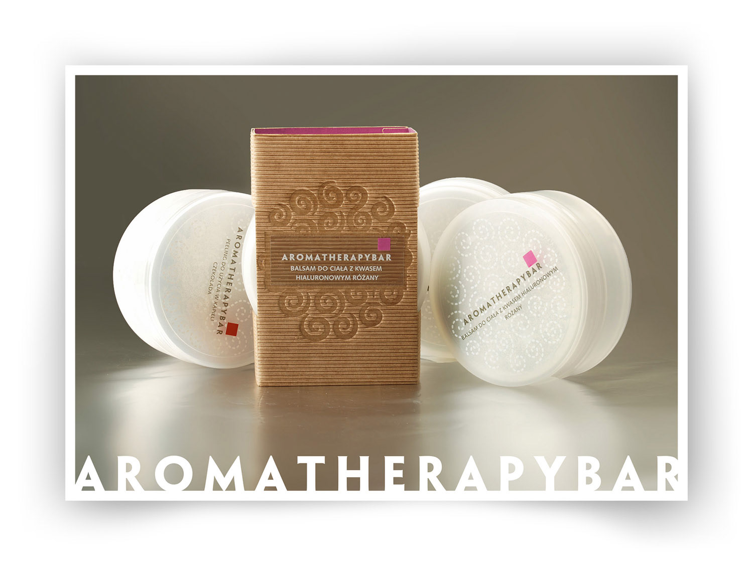
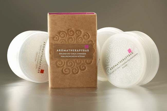
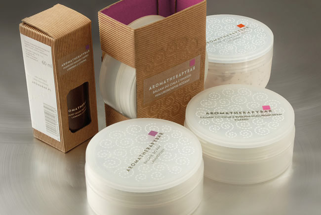
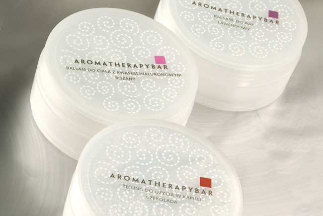
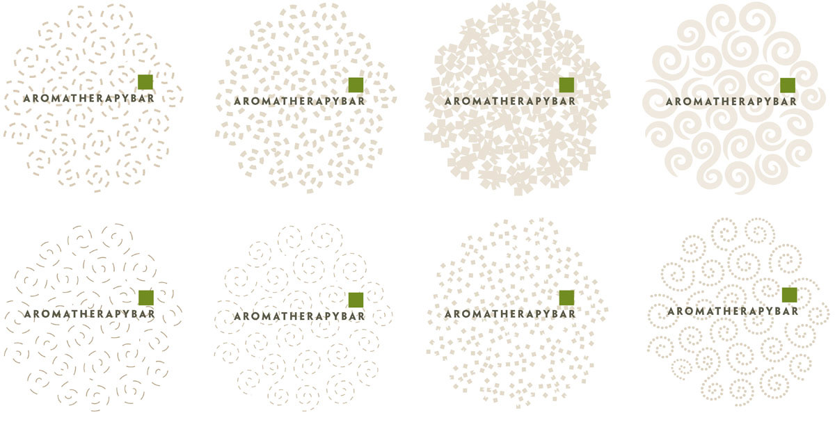
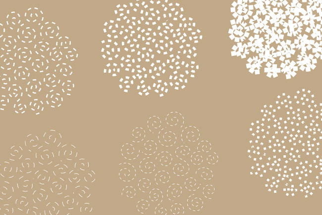
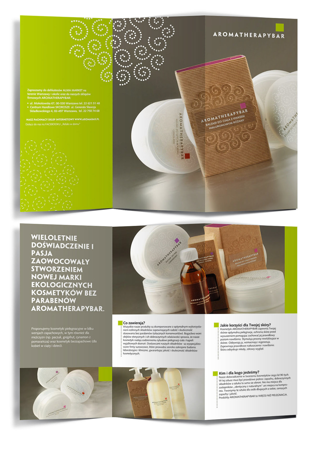
Aromatherapy is a line of very high quality cosmetics, based on natural ingredients, with no parabens. Part of these products is made by hand. The task was to create Aromatherapy brand logo and identity, develping of structural design of cardboard wrappers and the final graphic design of packaging that will show naturalness and quality in a proper elegant and subtle way. This extraordinary character is emphasized by a material used for wrapper - a decorative corrugated natural cardboard that gives a strong impression of naturalness. Combined with subtle, minimal in form labels makes this packaging very stylish. Gentle revival is obtained by a small rectangle in the logo, which color indicates a fragnance line. Cardborad has a decorative embossing in the form of spiral ornaments, this motif is also common to the whole line, used also in background of the containters labels.
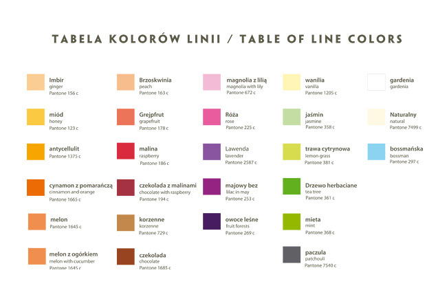
Aromatherapy is almost 100 products, including natural plant and glycerine soaps, lotions for hands, feet and body, body butters, massage oils and bath, peels, salt and sugar scrub nad bath balls, and - interestingly - an aromatic water for iron. You may choose from over 20 fragnances, some more traditional, and some unusual - such as chocolate with raspberries, melon with cucumber, grapefruit wit ylang or lemon grass.
Aromatherapy is almost 100 products, including natural plant and glycerine soaps, lotions for hands, feet and body, body butters, massage oils and bath, peels, salt and sugar scrub nad bath balls, and - interestingly - an aromatic water for iron. You may choose from over 20 fragnances, some more traditional, and some unusual - such as chocolate with raspberries, melon with cucumber, grapefruit wit ylang or lemon grass.
Project was made from scratch and covered all steps - branding, packaging structural design, materials, preparing all products for printing and production.
Pachnidło Trade
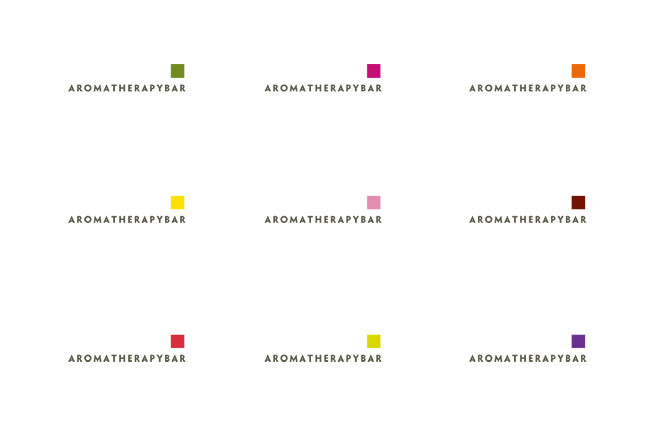
Aromatherapy logo is dynamic - changing color of the box is an indicator of frangancy at the same time. This color is then repeated on the inside of the wrapper. Complete table of Aromatherapy colors and fragnances is shown at the bottom.


Elements of Brand Identification
Promotional flyers

Store displays