KPG Geomatics
KPG
Visual Identity of KPG Ltd.
Visual Identity of KPG Ltd.
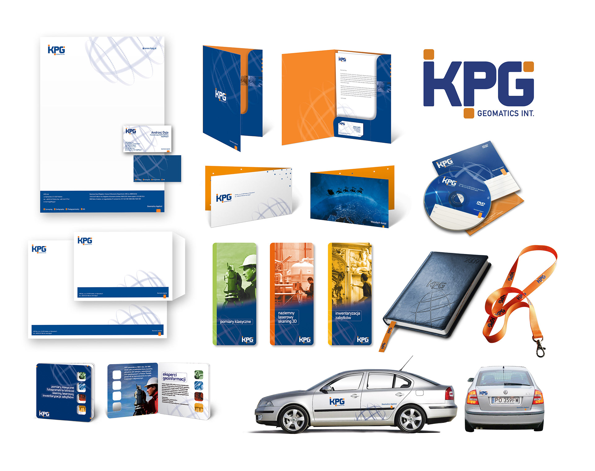
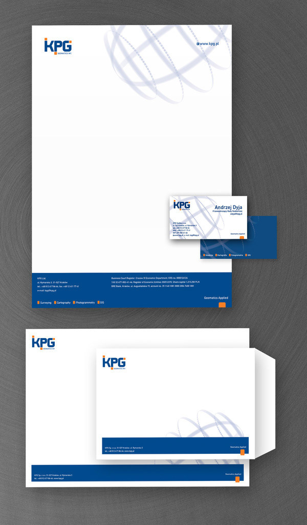
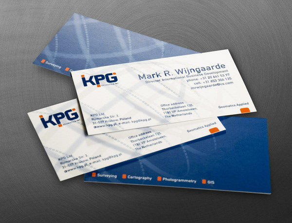
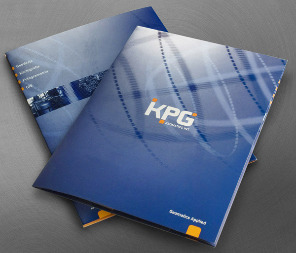
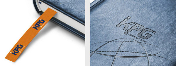
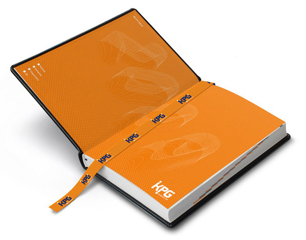
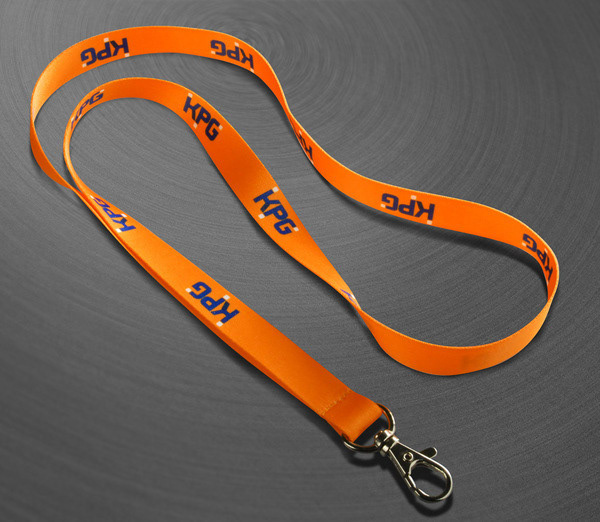
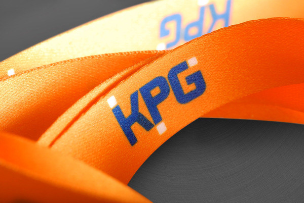
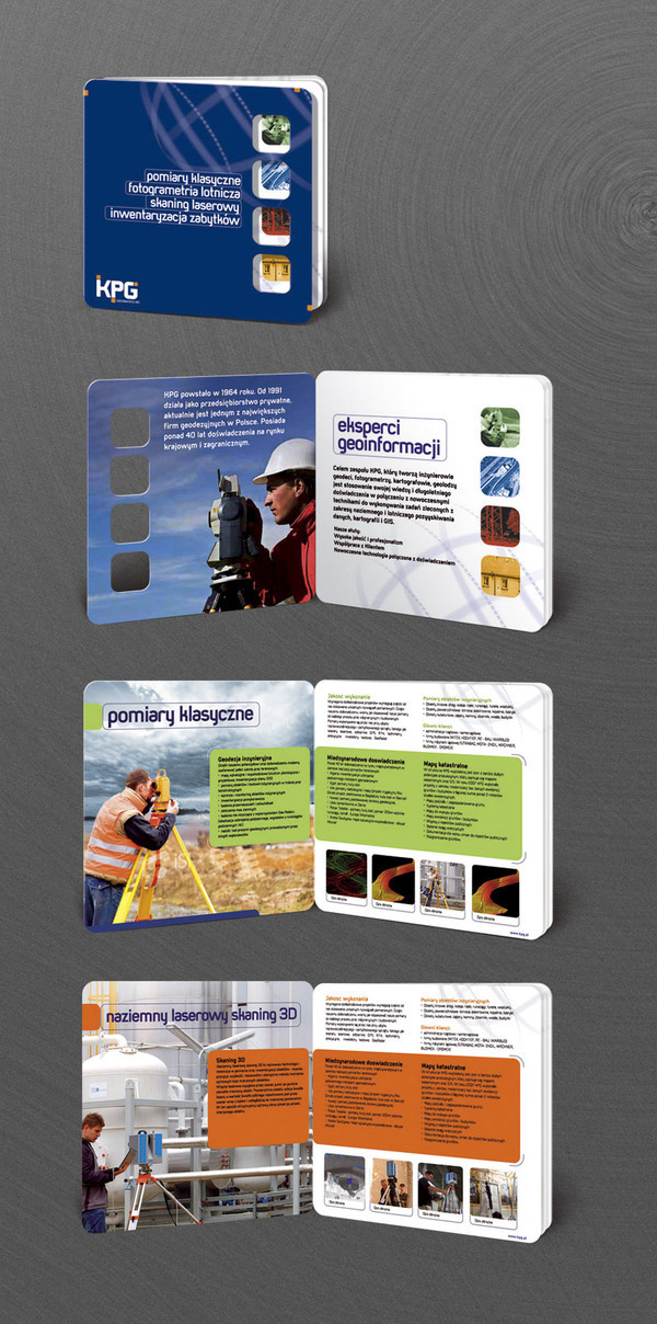
KPG has decades of experience and tradition in surveying. This Cracow, Poland based company was using its previous logo almost from its begining, and actually it didn't have any other element of visual identity. Also, old logo didn't fit into today's vision of company, with its high-tech, advanced solutions. First objective was to refresh the logo, but then, at some stage of work progress, completely new and modern solution was chosen. So the final logotype is based on a simple, strong letters, with addition of small rounded rectangles. These are positioned in differend corners of the logo, pointing different ways of technological development. Orange makes this process dynamic, and links to a traditional color of surveyers. Complete set of materials - collateral, folders, ads, cars and gadgets has been designed.