Cledar
Cledar
Corporate Identity for Cledar Ltd.
Corporate Identity for Cledar Ltd.
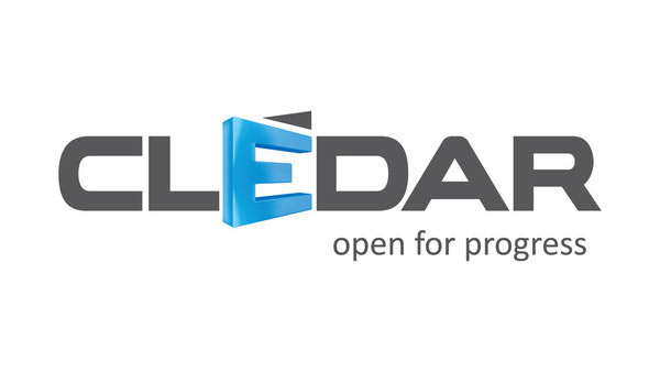
Cledar Ltd. is a Poland based company. It deals with creating a specific type of software - solutions for medical and monitoring environments. It's name - Clédar - in French means the guichet, kind of a village gate, as it can be seen sometimes on a blissful pictures of road on a meadow. This weird connection - of computer programming and this vintage doors - had to be wisely solved and explained. Also, company founders wanted their logo to somehow contain this symbol of the doors. Another challenge for the identity was putting it all together: company proffession - software programming - with medical character.
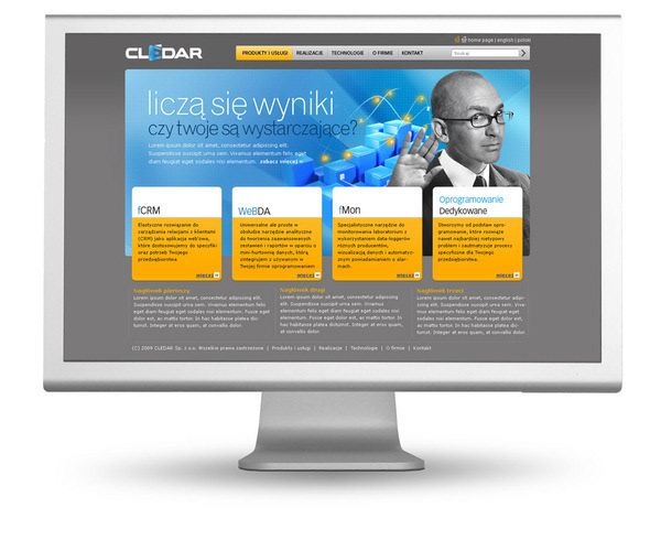
First goal is achieved with a typographic solution within the logo - where the letter e becomes the door. And the logotype is accompanied with short and simple claim. "Open for progress" - no less no more - pointing at advanced technologies, stepping into advanced future and being simply open for the better, new tomorrow. Of course, human is always most important, and the final look of company identity shows people, all in a fresh and bright-light design.
First goal is achieved with a typographic solution within the logo - where the letter e becomes the door. And the logotype is accompanied with short and simple claim. "Open for progress" - no less no more - pointing at advanced technologies, stepping into advanced future and being simply open for the better, new tomorrow. Of course, human is always most important, and the final look of company identity shows people, all in a fresh and bright-light design.

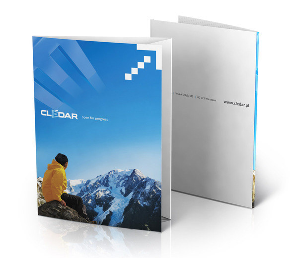
Series of folders show this human-friendly mood. No digital fireworks - just the man, and open space in front of him. The only cumputer-kind element in materials is the symbol of an arrow - digitally pixelated, and pointing up - to the progress and future.